 With figures from the World Health Organisation (WHO) showing that 3.2% of people in Europe are considered blind or visually impaired, it’s more than likely that you are sending marketing emails to a number of recipients who may be unable to access them properly.
To combat this, our resident email experts Ben and Dwayne have put together a list of simple but effective ways you can make your emails more accommodating to all of your subscribers – particularly those who are visually impaired.
Good for: screen readers
You would be hard stretched to find an HTML email that hasn’t been coded using tables. They are great when creating a structure which is respected across many email clients, however when it comes to using a screen reader (a piece of software that converts web content from text into either speech synthesis or braille display) they can be a nightmare.
(To get a better idea of what a good and bad example of table layout for screen readers looks like, check out this YouTube video.)
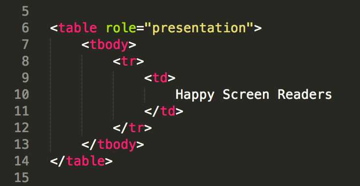
Luckily, there’s one easy fix that will stop the screen reader from declaring every row and column in the table (before announcing its content). Add the attribute role=”presentation” to every table and the screen reader will just dictate the content and not the row and column numbers.

Good for: screen readers & non mouse input
Semantic code means using HTML tags in the manner in which they’re intended; such as using <h1> for the main heading text and <p> for the paragraph text.
Why is it so important?
Semantic code not only assists screen readers in providing the right context to the content they’re reading, but (just as importantly) enables the user to navigate different sections based on the section headings, allowing them to get straight to the content that interests them.
Consequently, if a visually impaired recipient wishes to skip parts of an email without using a mouse, they can just select which section they would like to be dictated based on its heading.
Most of your images will probably have an alt text value in case the content doesn’t load, however this is also useful for screen readers to give further context to the your brand’s message.
Good for: screen reader & non-mouse input
Maintaining a sensible structure is almost as important as using semantic code. This will also aid with navigation for people using screen readers and non-mouse inputs by allowing their software to take the most logical path.
Screen readers will read content from cells in a left to right direction, starting at the top of the email and working down. This should be remembered when designing a responsive email, as it can sometimes result in less sensibly structured layout.
Good for: everybody, but particularly those who are visually impaired
According to Litmus, 53% of people read emails on their phones. Consequently, getting the font size right on mobile will benefit everyone. To help with this, we recommend checking out this list of suggested defaults from typecast.
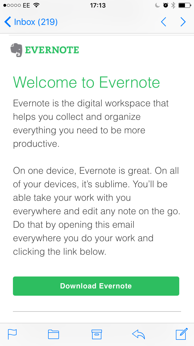
Here’s a good example of optimized text size for mobile from Evernote:

As you can see, the text is proportionate to the size of the smartphone screen, enabling a reader to easily absorb the information without having to squint and/or zoom-in.
Good for: dyslexic (if done right) & colour blind
This may sound like an obvious point, however the colour palette of an email template is often overlooked – especially if you’re using dynamic content. For example, if you have one image with a text overlay for women but a different one for men, it’s important to double check both versions have a colour palette that is easy to see.
Ensuring the text has a strong contrast against its background will not only make the text easier to read for visually impaired people, but also individuals with colour blindness – something which affects 4.5% of the British population (you can take a colour blind test here).
It’s worth noting that males are more likely to be affected by colourblindness; so if you’re brand is targeting a predominantly male audience, almost 8% of those emailed could be colourblind.
We hope this post helps you to make your marketing messages as accessible and inclusive as possible.
As Lead Integrations Developer Ben puts it: “Making these improvements to your emails will only involve a small amount of work, but will have a big impact for your customers.”
All of the above optimization techniques can be carried out for you by us. Learn more here.
Ometria is committed to protecting and respecting your privacy, and we’ll only use your personal information to administer your account and to provide the products and services you requested from us. You may unsubscribe from these communications at any time. For information on how to unsubscribe, as well as our privacy practices and commitment to protecting your privacy, please review our Privacy Policy.
Take the first step toward smarter customer marketing