
Leader
Summer 2022

Let’s face it, product pages are often more functional than fetching.
It’s understandable: when you’re building and testing pages that are geared towards selling, the overall ‘feel’ of a  product page – creating that killer first impression – can sometimes take a backseat to cramming in all of the elements you think should be there to encourage a purchase: social sharing buttons, big calls to action, shipping information, product images and videos etc. (LingsCars.com on the right being an extreme example of this!).
And while undoubtedly many of these elements are crucial in clinching a sale, it’s important to remember that product pages are also an extension of your brand and your story; they’re there to get people excited about your products, to add a bit of ‘wow’ factor.
This blog post will look at thirteen product page examples – brands who have the best of both worlds, combining all the essential elements of high-converting product pages with some seriously slick design: these guys get the job done, and look pretty fly while they’re at it.
AYR demonstrates that simple design needn’t be boring with this minimalist product page giving browsers the opportunity to expand sections for more information (so as not to interrupt the design).

Images take the lead in Burberry’s striking product pages that are completely in line with the brand’s image:

3) Lush
There’s nothing like a good GIF to inspire the senses. As mentioned in a recent post discussing beautiful product pages, Lush’s use of rich media combined with descriptive content, a strong CTA and social proof is simply wonderful.

Pretty, sharp and functional, we love how DENY incorporates auto-playing video into its product pages. Again, browsers can expand sections for more information.

An old example, but this Greats’ product page is, well, pretty great – we love how the super-long parallax pages make it easy for browsers to find any info they need, while retaining a strong, uncluttered visual impact.

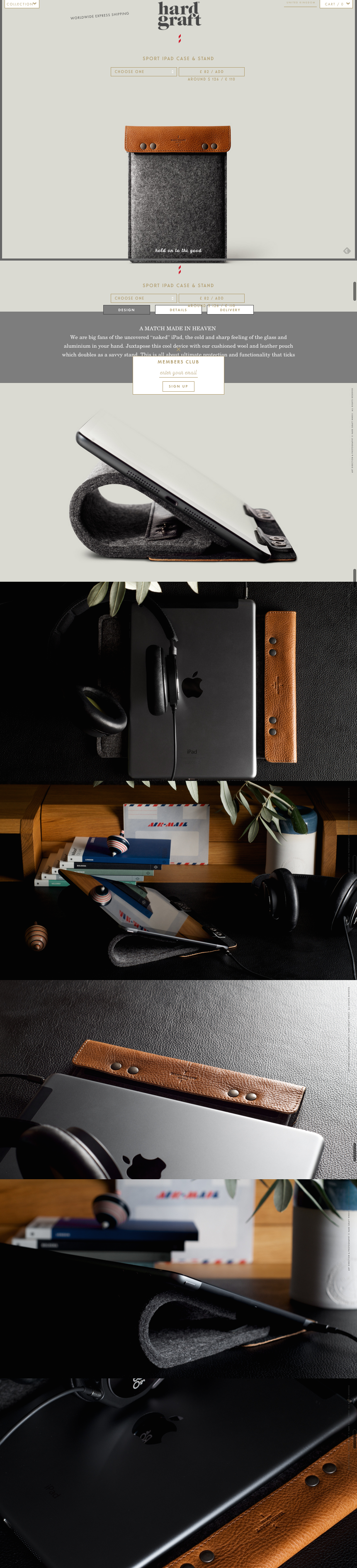
Much like Greats, Hard Graft uses parallax to showcase beautiful, high-quality images of its product, keeping words to a minimum.
The heritage brand is making wellies cool again with these great, visual product pages. Here’s a mid-scroll screengrab:

Jo Malone’s product pages ooze class. We love the “taste notes” section in this example, diving into the product’s ingredients and intricate smells – bringing it to life.

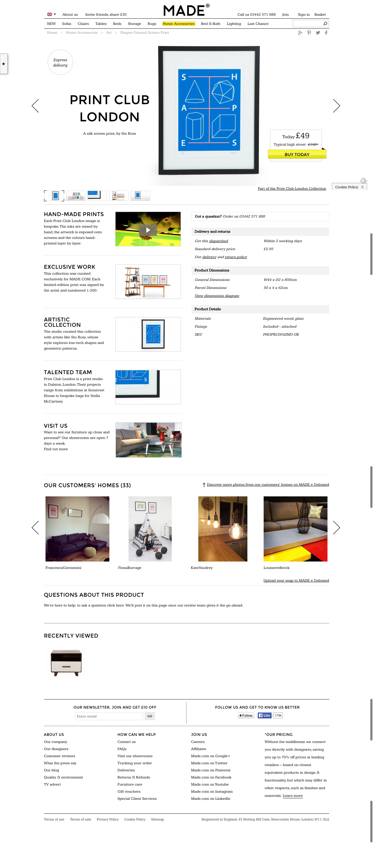
9) MADE.com
Simple, clean, functional design from the guys at MADE.com.
We love how the crisp, wide-screen photography in New Balance’s product pages showcases even the minutest details of the brand’s sportswear.

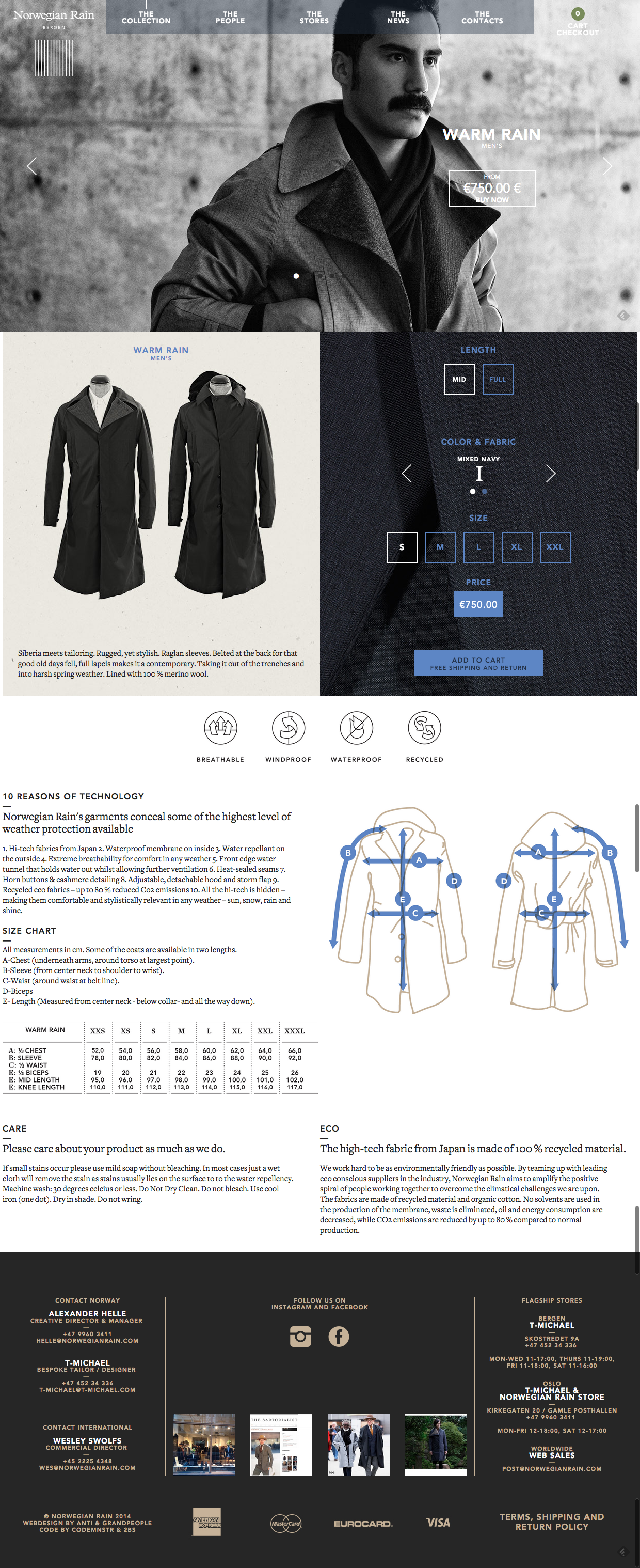
The brand – ‘a sartorial take on extreme high-performance outerwear’ – uses a tiled effect to make its product pages easy to consume.
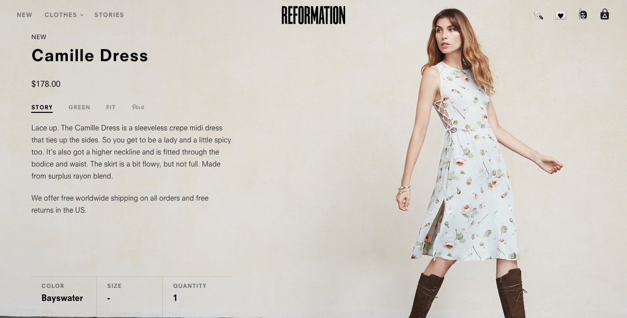
The womenswear brand uses full-screen images with a text overlay to capture the attention of visitors.
Boldly designed with strong fonts and images, we love how V76’s product pages reflect the brand image and story perfectly.

With the tagline “The abnormal beauty company”, it’s no surprise that DECIEM has product pages like no other. Founded in 2013, its ecommerce site boasts top-notch quality images and cutting-edge design, giving each section a distinctly contemporary feel.

Further reading on product page design:
Ometria is committed to protecting and respecting your privacy, and we’ll only use your personal information to administer your account and to provide the products and services you requested from us. You may unsubscribe from these communications at any time. For information on how to unsubscribe, as well as our privacy practices and commitment to protecting your privacy, please review our Privacy Policy.


Take the first step toward smarter customer marketing