
Leader
Summer 2022

Last year was full of milestones for us at Ometria.
Sure, 2019 was hardly a triumph for humanity as a whole, but here in our little Ometria bubble, we celebrated some pretty big achievements (though we do say so ourselves): closing a $21m Series B funding round led by Octopus Ventures; hitting 100 employees and 200 clients (not literally); moving into a swanky new office and winning a Europa award for the ‘Best Martech Startup’, amongst other neat stuff.
So to celebrate how far we’ve come, we decided to treat ourselves to a bit of a makeover.
Because when it came to our visual identity, up until now we’d been in the awkward adolescent phase. You know, when it seems acceptable to wear pyjamas in public or the same pair of trousers for 7 days straight. It was time for us to fix up for the new decade.
Part of it was also about wanting to stand out. In the years since our last website update, marketing technology had developed a very particular affinity for blue to purple gradients, and we weren’t content with being part of the crowd.
Since we’re grownups now, we wanted to take a serious approach to our rebrand. We wanted to create a visual identity that reflected us as a team and, most importantly, made you – our customers and friends in the industry – feel part of something exciting.
This blog post will walk you through our new brand, and give you a snapshot of the process that we went through to get here.
(p.s. if geeking out about visual identity isn’t your jam, skip to the end to see the good stuff.)
Before we got creative, it was important that we cracked the whip and had a process. First and foremost, we wanted the Ometria visual identity to be more than just an amalgamation of colours and fonts and illustrations that we as individuals thought were kinda cool; we felt really strongly that it should reflect exactly who we are as a company.
Here are some of the steps we took:
Our existing customers were our first port of call when it came to new brand research. We conducted in-depth interviews with a select group of them to talk in detail about:
What stood out from these interviews was that our customers really love our people. They like how approachable we are; how hard we work for them. But, in contrast, they didn’t feel like this warmth and friendliness was reflected in our brand, which was something that we set out to change.
Of course, it was important to complete the circle, so we made sure we regularly checked in with those same clients (and new ones) about the direction the new brand was going in.
Ometria is really passionate about culture (read our 193-slide culture deck if you don’t believe me), and our company values form a core part of that. So we wanted to make sure that these values – which you can read more about here – were reflected in the website.
Now time for some introspection: the final piece of the puzzle was making sure that the new brand reflected our perspective on the future of the company and product, and our place in the marketing tech ecosystem.
The Google Ventures Brand Sprint was a really useful exercise in distilling some of the core characteristics that we really wanted to be a part of our identity; with words like ‘innovative’, ‘approachable’ and ‘experts’ coming to the fore.
With our research complete, it was time to translate all the things we had learned into a brand identity. To walk you through some of the core elements of the brand, I’m going to hand over to Ed, who was the design mastermind behind the new visual identity.
In March 2019 we embarked on a ten month journey to completely rethink the Ometria brand. Our task was to position a fiercely innovative, culture focused tech brand, with loads and loads of personality, as the market leader and innovator. And yeah, I am sweating from just reading that.
We wanted an identity we could rally around; one which was a reflection of our innovation and principles. Something that is a true representation of the energy and vibrancy which flows through the team.
Our creative strategy was first guided by understanding what it means to be an Ometrian. Then, following creative workshops with key stakeholders in the business, we set out the principles that would inform the rest of our exploration.
From logos and typography to patterns and illustrations, as a team we crafted and evaluated a variety of different options. Some were exciting peeks into different realities of what ‘could be’, whilst a few others were frankly taken from the Bob Ross book of happy accidents.
Nevertheless each time we explored, we better understood what it was we were aiming for. We were committed to crafting something which communicated all the ideas we’d established in our workshops and that just made us feel good.
Where we landed was a wonderful concoction of elegance, familiarity, warmth and innovation. Deconstructed the logo provides bitesize clues towards the fundamental pillars of Ometria, but unified it is a symbol of our ongoing commitment to knowledge, innovation and the respect that we have, for the trust placed in us.
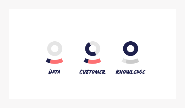
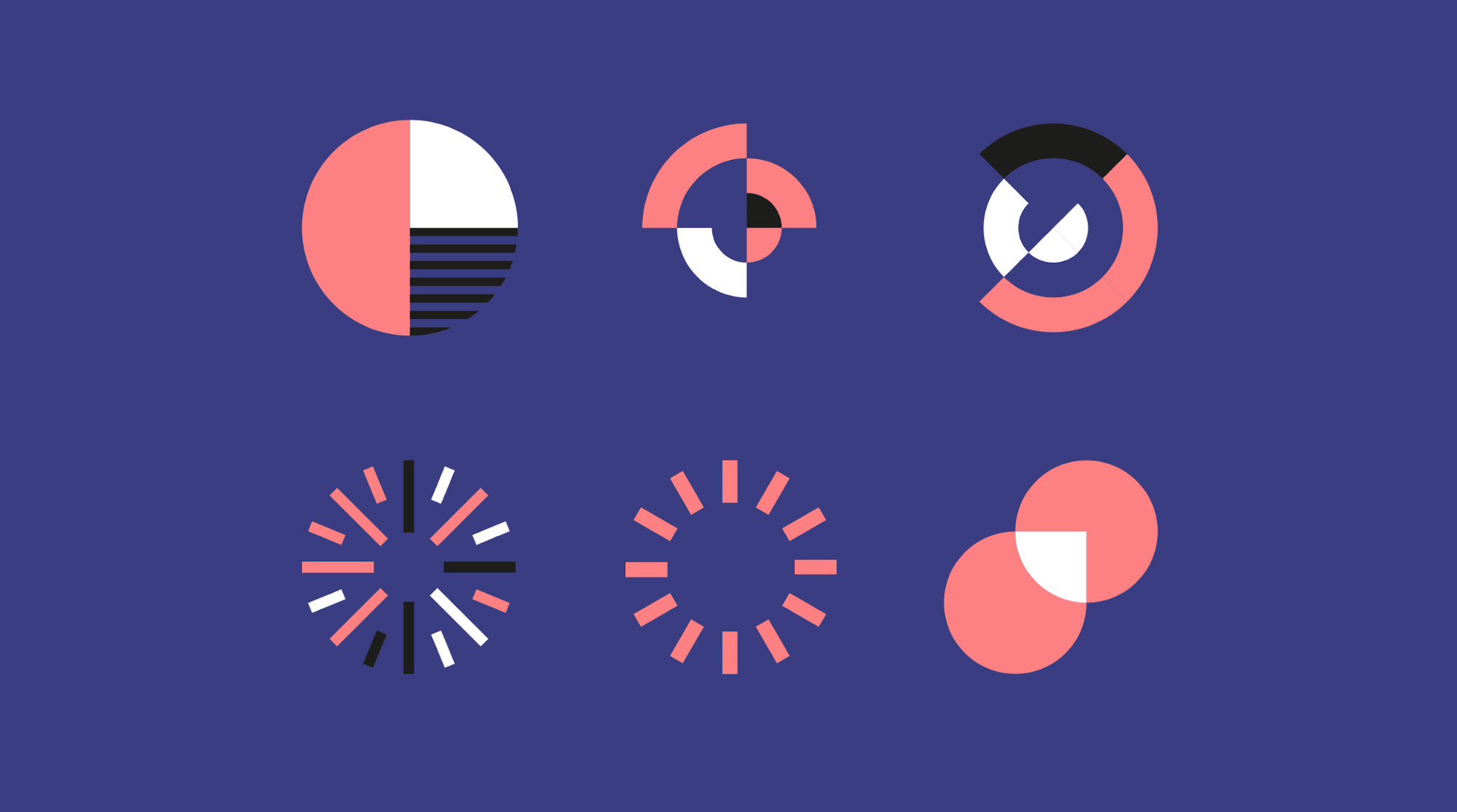
It sounds as obvious as an orange bathrobe, but Ometria is a human brand. We’re not buzzwords or robots and our culture isn’t a ping-pong table and two dodgy paddles. We’re built on the strength, passion and togetherness of our people. So to bottle that warm and fuzzy feeling, our visual language also had to reflect this sensibility. We split the key components of this language into a few categories, ones which would form the basis of our brand communication. These were simply: illustration, typography and colour.
What I feel we achieved is a system that’s got just the right levels of energy, vibrancy and professionalism. What’s all the more wonderful, is that it is able to do this whilst still feeling familiar and genuine.

After all the messaging, strategy, commercial and all other business talk, when you get down at the atomic level, the brand is just so much fun. It’s immensely enjoyable to work with as a “designer” and, when you experience it in the real world, it evokes this sense of joy and lightheartedness that is infectious.
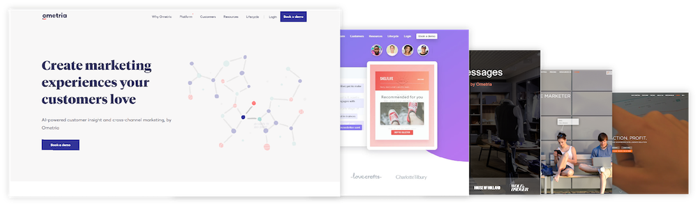
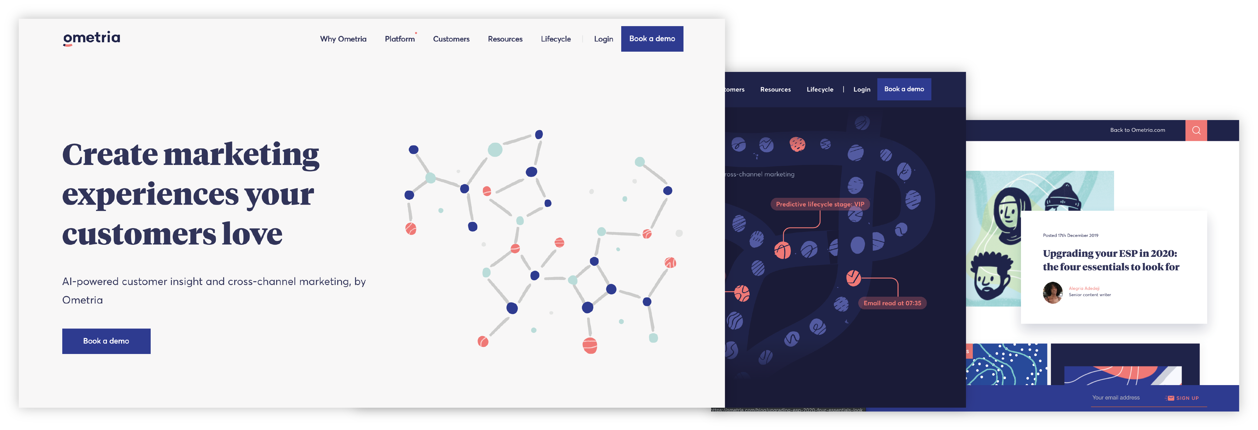
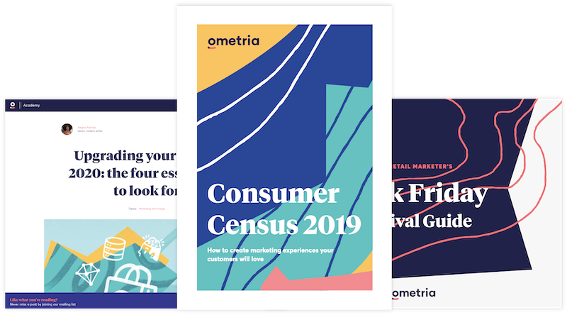
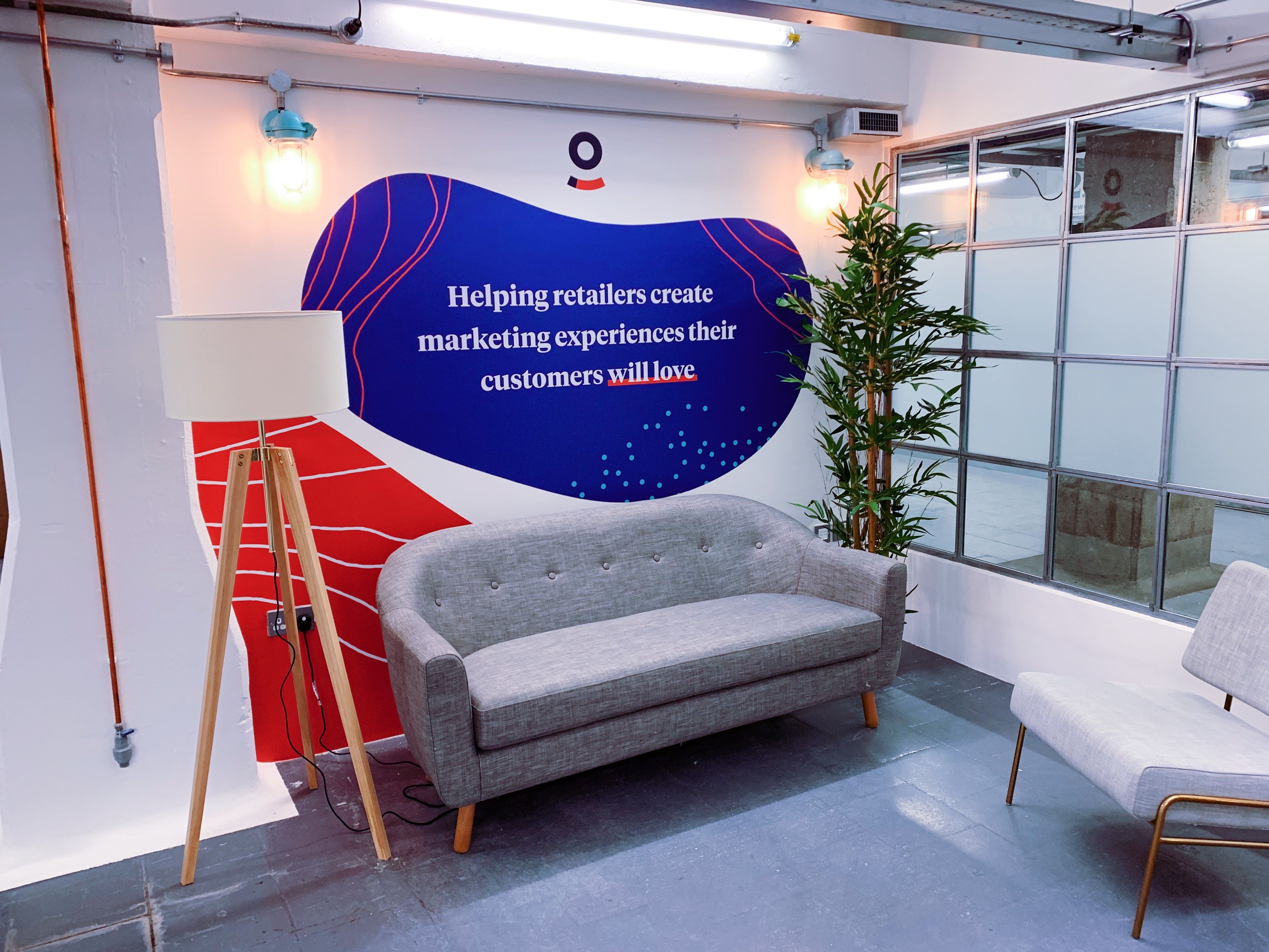
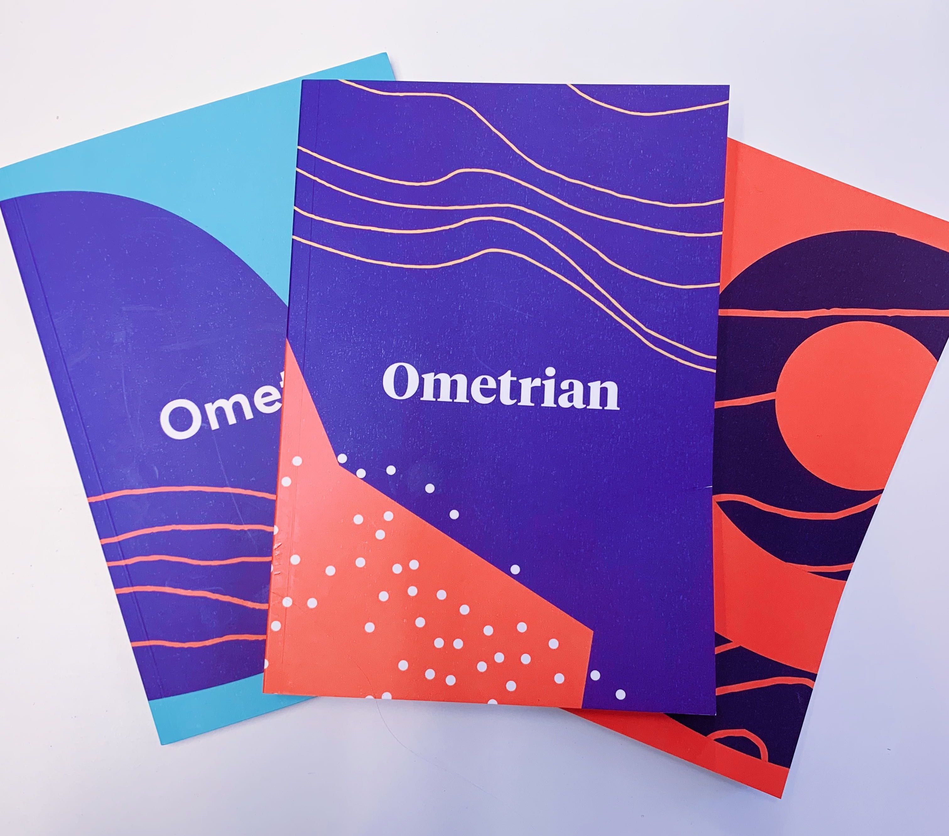
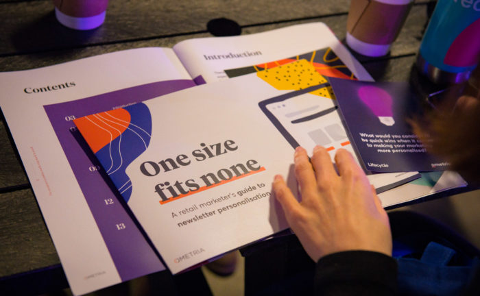
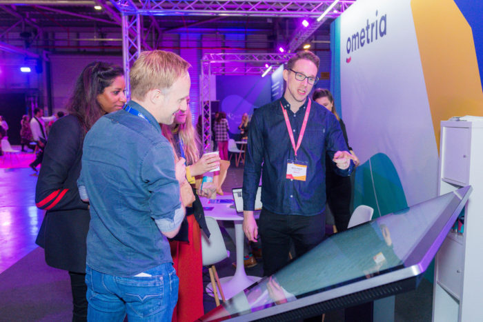
So, what did we end up with? Here are some examples of how we’ve applied the new visual identity.

Ometria is committed to protecting and respecting your privacy, and we’ll only use your personal information to administer your account and to provide the products and services you requested from us. You may unsubscribe from these communications at any time. For information on how to unsubscribe, as well as our privacy practices and commitment to protecting your privacy, please review our Privacy Policy.


Take the first step toward smarter customer marketing